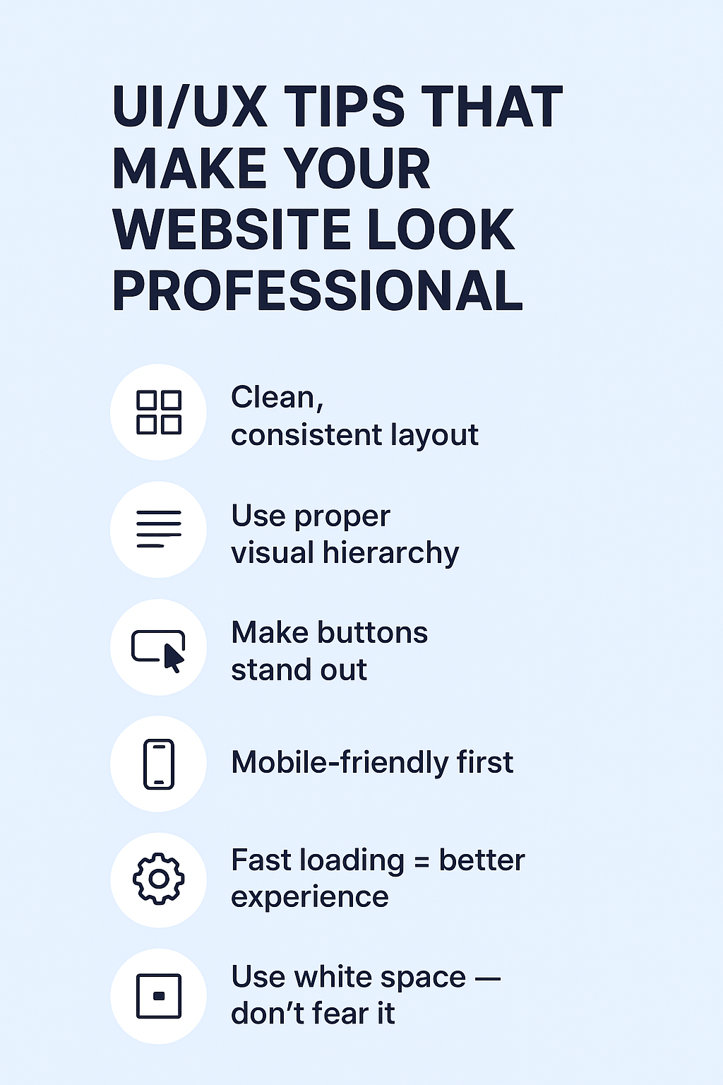
1️⃣ Clean, Consistent Layout
A professional site looks organized.
Use proper spacing, consistent fonts, and a clear layout.
If everything is bold, nothing stands out.
Keep it simple, clean, and structured.
2️⃣ Use Proper Visual Hierarchy
Think of your page like a story:
- Big text = important
- Medium text = supporting
- Small text = details
Let the user’s eyes flow naturally.
3️⃣ Make Buttons Stand Out
A button shouldn’t blend with the background.
Use contrast.
Make them easy to see, easy to click, and consistent across the website.
4️⃣ Mobile-Friendly First
80% of users browse on mobile.
If your site breaks on small screens, it breaks your professionalism.
Test every page on different devices.
5️⃣ Fast Loading = Better Experience
A beautiful website that loads slowly is still a bad website.
Compress images, optimize code, and use lazy loading.
6️⃣ Use White Space — Don’t Fear It
White space makes your website breathe.
It’s not “empty”; it’s intentional design.
Crowded websites look cheap. Clean websites look professional.